I came across another wonderful map as I reviewed the Dead Tree Media over the weekend. The City of Toronto bought a full-page advertisement hoping to entice tourists from the northeast United States to cross the border into Canada for a weekend or a few days. They presented several lighthearted graphics designed to attract the attention of the ironic crowd.
I don’t think “curmudgeonly suburban dad with attitude” was the target demographic for this particular marketing campaign. Ordinarily I would have flipped to the op-eds so I could grumble in peace before the family woke up. Not this time. This map snapped me from my normal routine and drew attention to the page. I’m a sucker for an entertaining map.
Lots of the U.S. Farther North Than Toronto
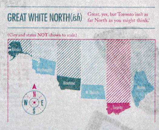
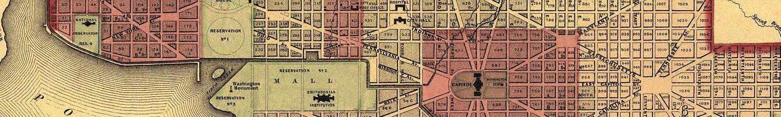
They were hoping to convey that at least a few places in Canada are much further south than large portions of the United States. Toronto is a case in point. I focused on that thought in fair detail in one of my previous articles. However, naturally, I didn’t have a graphics department at my disposal to produce an original design. All I had was Google Maps and the ability to draw a straight line of latitude.
Notice the image on the other side of the page bleeding through. It looks like a mobile phone advertisement. Oh, I love those newspapers and all their inky goodness. Future generations will never get to experience black smudgy fingertips.
What I really like best about this image is their compulsive need to inform the readership that “City and States [are] NOT shown to scale.” I could ponder this cynically and make a snide comment about the state of education and geography. However I think I’ll take a different cynical approach, If they didn’t include a disclaimer then people with too much time on their hands — the ones who go out of their way to find offense with everything — would send lots of nasty emails.
It would be a pretty strange world if the graphic was to scale, with Toronto larger than Alaska, and Maine joining it as the big behemoths on the block. Go Maine! Think of all the lobster!
Positive Correlation Between Height and Fun
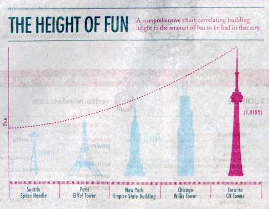
I also enjoyed this other graphic, “The Height of Fun: A comprehensive chart correlating building height to the amount of fun to be had in that city.” It purports that there’s more fun in Toronto than Seattle, Paris, New York or Chicago. That’s pretty funny if only because of its sheer outlandishness. I think Toronto is a great place but let’s get serious. Twice as fun as Seattle? 50% more fun than New York? … not to mention similar claims for the other cities.
I guess I should mention their website URL seeing how they published a full-page advertisement in a major U.S. daily newspaper. What does that cost now, like 10 bucks or so?
Leave a Reply